Migration History in Tree Rings
Migration is a fluid process; it reflects the progress of life while also being integral to it. Two Northeastern University professors, Pedro M. Cruz and John Wihbey, created a digital image depicting two-hundred years of immigration to the United States, represented as the rings of a tree. The model was formed by an algorithm that visualizes both the numbers of immigrants arriving in each period, as well as their backgrounds as the rings of a tree. Both trees and countries can be hundreds of years old. During that time, gradual cell growth of trees affects the shape of the trunk while leaving informational marks, just like how the arrival of immigrants has developed the strength and character of the United States. The size of a tree’s rings can vary; likewise, the total amount of immigrants and where they come from can change decade by decade. That is exactly how the rings of the immigration tree are organized — in intervals of ten years.
The Tree Rings Were Shaped by History
The rings on the tree depicting nineteenth-century migration to the U.S. show a majority of European and Canadian immigrants, with small amounts of Asian and Latin American immigrants. While greater from the 1850s to 1870s, the number of Asian and Oceanic immigrants begins to decline in the 1880s due to factors such as the Chinese Exclusion Act of 1882 and other exclusionary legislation. The arrival of Asian, Oceanic, and Middle Eastern immigrants does not pick up again until the 1960s, when the Immigration Act of 1965 was passed. The number of Latin American immigrants slowly grows in the late nineteenth to early twentieth century and then sharply increases after the early 1940s.
Immigration from Europe is high in the period just before World War I, although the opposite is true for World War II, with the pertinent rings quite close together. However, it is ultimately the Great Depression that represents the tightest distance between any two rings. After the 1965 Immigration Act, the rings become more widely and evenly spaced, showing that both the quantity and diversity of immigrants are increasing. In the years following that legislation, the colors become more evenly distributed than ever before. Although still only representing a smaller portion of the total population of immigrants, more Middle Easterners begin appearing between the rings following the 1960s. It isn’t until the 2000s that immigration from Africa becomes visually distinguishable among the other colors. (Note that U.S. Census data, which the model derives from, omitted the populations of African slaves and indigenous peoples.)
The immigration tree rings can be seen at the link below:
Teaching Ideas:
1. In what ways can comparing immigration to natural growth, such as tree rings, help people understand the impact of immigration? How might describing immigration as a fluid and organic process change the way that people view it? What does the tree ring model show about the impact of immigration over time?
2. After seeing a graphic representation of United States immigration over the last two hundred years, what surprised you the most? Going in, what did you expect? Did it differ from how you predicted it would look? If so, why?
3. Go online and research timelines of immigration. How do the marks on the timelines compare to the distances between rings and their related years? What are the most influential factors that affect the quantity and diversity of immigration?
4. A picture is said to be worth a thousand words. Keeping that in mind, in what ways has the power of the visual been used to teach about immigration over time? How do photographs, drawings and political cartoons influence our understanding of the subject?
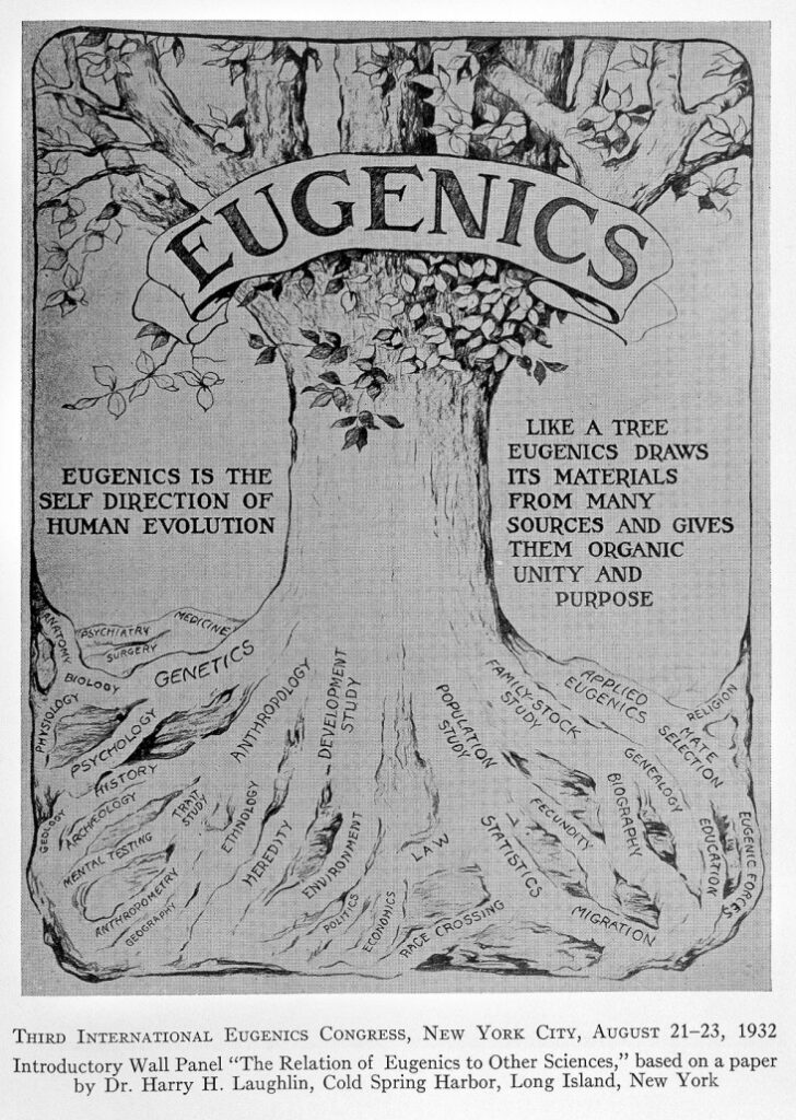
5. In the early 20th century, Eugenicists, who argued that laws protecting the racial purity of the U.S. were necessary to protect the country, also used images of trees and nature to spread their anti-immigrant propaganda. Refer to the image below. How does it compare to the rings from the National Geographic article? What is the message that Eugenicists were trying to send by using a tree?